We are happy to announce to you the launch of our new Interprefy logo as part of the ongoing evolution of our company’s brand.
In the life of every company there comes a moment when you need to look closer at who you are and who you’ve become and make that visible also to others.
That moment has come in Inteprefy. We are not the Swiss startup we were 3 years ago, but a global team spanning 5 continents and 29 countries. Our creative marketing team has been busy updating our visual identity to reflect what we stand for now and how our company is approaching our vision of barrier-free meetings today.
We believe that in today's complex and globally interconnected world, conference and event planners need not only smart and flexible solutions, but trusted and visionary partners that speak their language.
With the evolution of technology, the adaption of new hybrid work models, and worldwide connection at people's fingertips, the needs, and requirements for real-time translation continue to grow and evolve and demand leading-edge solutions that combine the best in technology with linguistic expertise.
Over the past years, we have grown rapidly, our technology has evolved rapidly and we've supported over 50,000 multilingual events of all shapes and sizes. Ranging from intimate Zoom meetings, to the world's largest sports events, and even to connecting an astronaut on the ISS to a world expo.
Today, we're proud to be a trusted partner of world-leading institutions, language service providers, meeting platforms, universities, event agencies, and production companies to bring our multilingual meeting expertise to their delegates and event audiences.
Goodbye to our previous logo
Our professional profile has grown and evolved over the years, and now it is time to adapt. We have altered our logo to reflect who we are today and to symbolize our dynamic future.
We have chosen a new logo that is modern with key elements that convey our mission and orientation for growth, while remaining true to our longstanding reputation of delivering excellence.
Our old logo did a really great job for years, but the time has come to move on.
We decided to go for something a lot more dynamic, solid, bold, and modern. Without going far from the old identity, we added more focus on the ‘i’ in Interprefy and also went for a more solid typeface.
The "i" in Interprefy
Our technology and services today are all geared around our collective vision of all professional meetings and events being free of language barriers.
With our new brand mark, the "i" in Interprefy takes center stage.
To interprefy means to combine linguistic expertise with cutting-edge scalable and secure technology to facilitate understanding across languages and cultures.
Brand elements
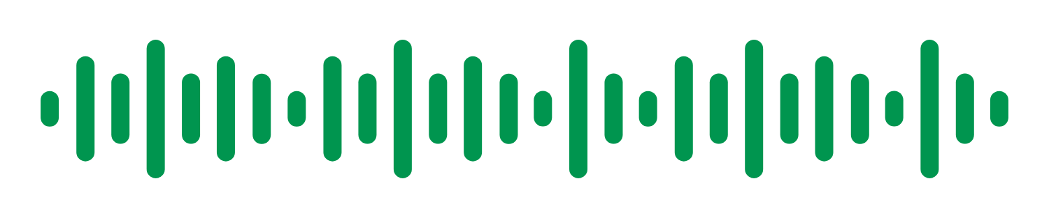
The voice
The sound wave is our visualization of voice. It represents the universal symbol of sound and conveys the fluid, dynamic aesthetic that speaks our story. Differently-sized vertical soundbars are paired with each other to create this.
The color palette
We wanted to introduce new colours into our brand to reflect our commitment to diversity and inclusion. We've created a palette of fresh, positive, and powerful colours that is also colour blind safe for deuteranopia, protanopia, and tritanopia.
New headline font Sora
Our typography ties all our verbal communications together. It plays a vital role in expressing the appropriate sentiment and message that help our audience through their journey with us. We have chosen Sora to complement our corporate font family. Sora, meaning sky in Japanese, is focused on empowering projects that benefit society by delivering new goods and services.
Revamping our website
Along with announcing our new brand identity, we have revamped our website and continue to improve the user experience. The new site delivers rich new content in a modern, clean, and organised layout to provide visitors with easy access to our solution information, highlighting our latest innovations in conference interpretation and event translation solutions.
The new logo and brand identity reflect the bold, energetic, and forward-looking culture of our company, and are designed to inspire and further elevate us as we continue to provide leading-edge interpreting solutions for our current and upcoming customers.


 More download links